Bridget H Jackson
  • Home
  • About
  • Latest news
  • Recent work
  • Works in progress
  • Blog
  • Biography
  • Contact

The art of repair, part two

12/29/2013

1 Comment

 
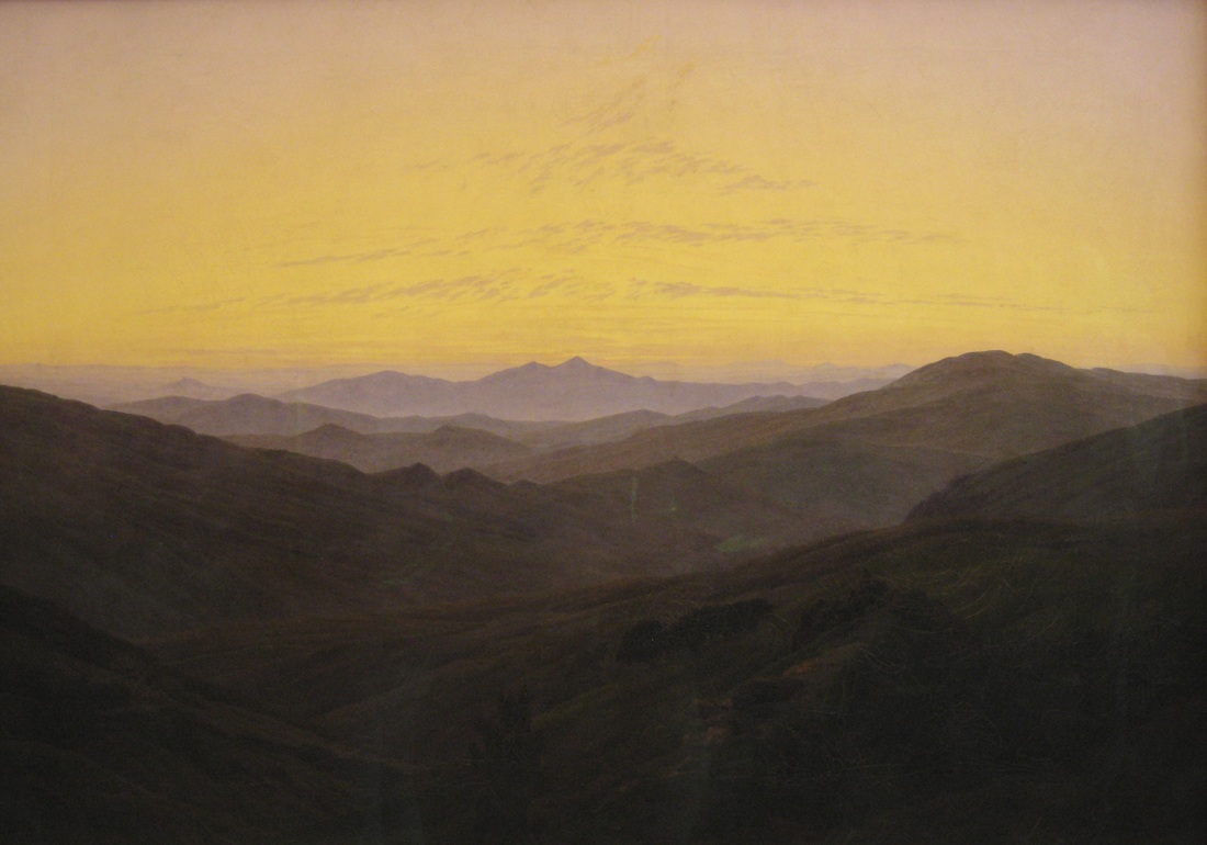
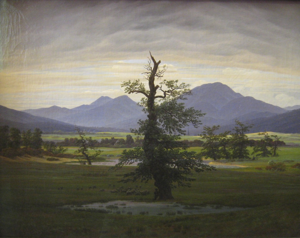
Earlier in this blog I wrote The art of repair: responding to the Neues Museum, about a museum in Berlin which has been painstakingly repaired so that the original bomb-damaged building and new repairs are distinct yet harmonious. Looking at frescoes in Italy over the past few weeks and the various ways in which they have been conserved or restored, has prompted me to return to the theme of repair. A theme which is relevant to my works on canvas, in which I resew their threads, using the act of repair to make something new. And now, in the aftermath of Christmas, seems as appropriate a time as any to post pictures of religious paintings, which dominated my Italian trip.  

I have been fascinated by the diversity of ways in which frescoes have been repaired and individual conservators have sought to preserve the original authenticity of the work, while presenting as complete an image as possible for visitors to enjoy. Of course, there are many, many frescoes where the repair is so complete that it is indistinguishable from the original. And those frescoes which have been recently conserved so that new and old are distinct, are more than likely to have had older repairs which were done with less transparency. As with any painting of a certain age, it is hard to know whether what one sees now is as the original artist intended it five hundred and more years ago.  

For me, the different fresco repairs which I came across seemed to split into acts of stabilization or conservation, and acts of recreation or restoration. In the first, which I came across a lot, the original is preserved but there is minimal attempt to recreate parts of the missing image. I saw only one clear example of the second, in which the restored fresco presented a complete image but on close inspection, one could see where additions have been made. 

This small Madonna and Child, in the house where Raphael was born and lived as a child, is claimed to be one of Raphael’s earliest works, painted under the supervision of his father, Giovanni Santi, who died when Raphael was eleven. Alternatively it has been attributed to his father, and interpreted as showing the newly born Raphael in the arms of his mother. Regardless of the original painter, parts of the Madonna or mother’s blue gown on her right shoulder and arm have been restored. The short fine, linear brush strokes that create the repair are different from the planes of colour, delicately blended together, in the remainder of the fresco. This is a work in a domestic setting, which meant that I could get close to it and see the different painting styles. Other frescoes in grander settings, the Sistine Chapel being the most obvious that comes to my mind, where one is kept at a distance are also repaired in this way. But one does not get close enough for the optical illusion to start to breakdown in the way it did here for me, my eye oscillating between the whole picture and the differences in painting style.
Picture
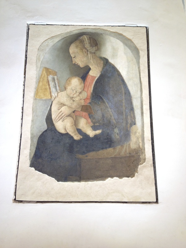
Madonna col Bambino, 15th century fresco attributed to Raffaello Sanzio, Casa di Raffaelo Sanzio, Urbino. Photograph: Bridget H Jackson
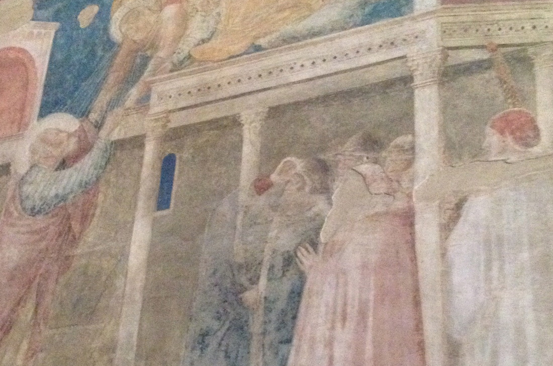
Much easier to discern are the disruptions left in images when no attempt at restoration has been made. So, in Santa Croce in Florence, the face of a figure in a crowd has been left as blank plaster, its shape forming a silhouette of forehead, nose and beard, between a faded frescoed red cap and cloak, painted by Giotto. While, multi-coloured cross-hatching cuts across the face and body of a figure at the edge of Domenica Ghirlandio’s Madonna della Misericordia e la Pietà in Ognisanti in the same city. There has been no attempt to blend with the colours of the skin, hair and clothes which remain. Rather than complete the picture, the newly-painted addition sits as an amorphous, abstract shape contrasting with the modeled eye, shoulder and hand of the original, drawing attention to the skilled way in which they have been painted. Finally, below the foot of St John the Evangelist a drawn head from an earlier image has been revealed through the fragmenting of the image which sits on top. It disrupts the decorative border of the fresco in the Oratorio di San Giovanni Battista in Urbino. 
I am drawn to these disruptions and unexpected disturbances. For me, they make the history of the images more transparent and have more integrity than restorations in which the original is re-rendered as complete. Through their modern interventions they clearly demarcate old and new, bringing authenticity to what remains of the former. I also like the unexpectedness of the resulting whole image, original and repair jostling for attention. 

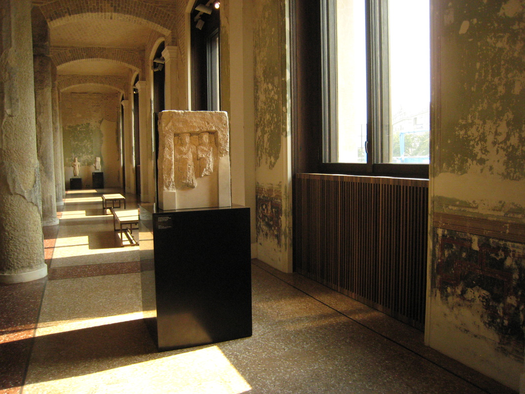
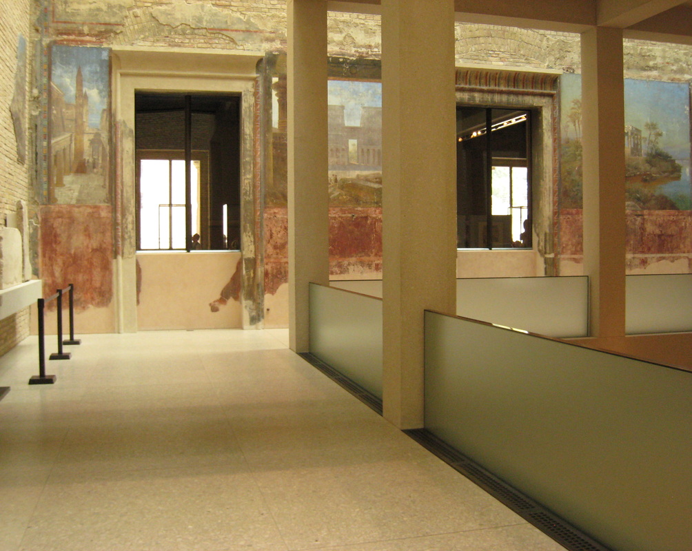
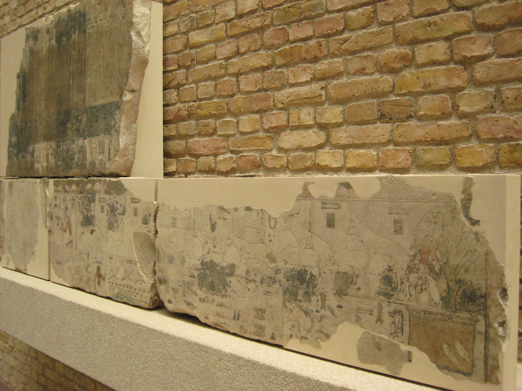
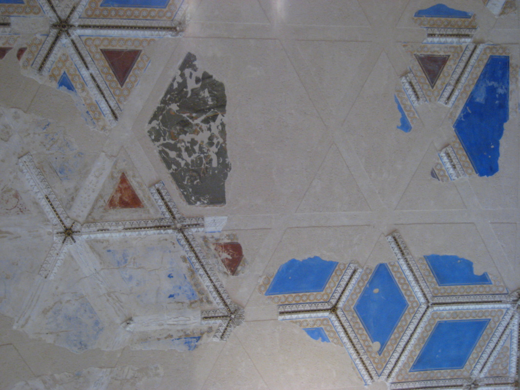
Of course, the images I have shown just have small fragments missing from a larger scene which is still largely visible and decipherable. I saw older frescoes in Pompeii and Herculaneum, used to decorate the interior of houses, which were far more damaged. Criss-crossed with cracks and patches of plaster, I couldn’t picture the whole decorative effect but the fresco fragments which remained were enough: snatches of bright colours, intricate detail and trompe l’oeil illusion. In some rooms, the design had been continued beyond the fragments, scratched into fresh plaster, to give an idea of the complete composition.  
Picture
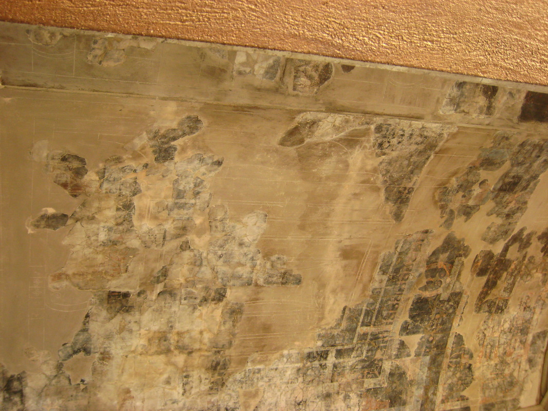
Ceiling in the casa del salone nero showing fragments of the original fresco with drawing completing the design, Herculaneum. Photograph: Bridget H Jackson
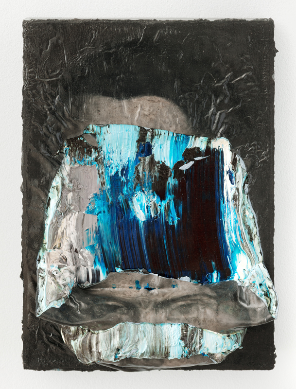
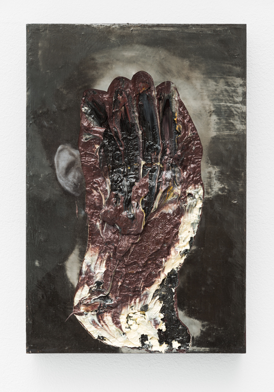
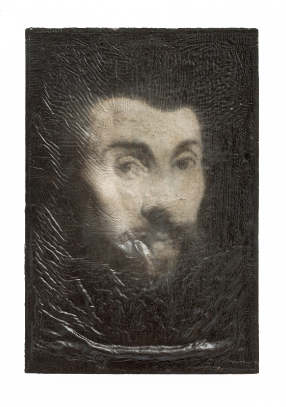
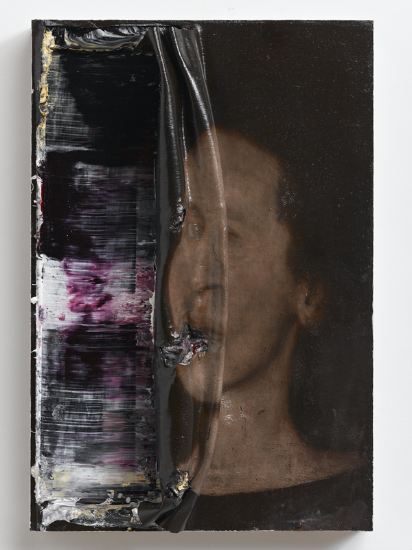
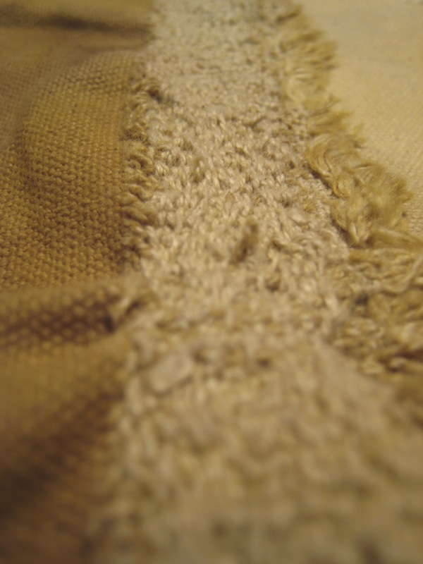
In my earlier blog post I wrote that my experience of the Neues Museum brought “me back to the possibility that I need to use materials with a richer narrative than new raw canvas”.  At the time I did not know what those materials should be. I am currently working on a canvas in which I have unpicked my own painting, so that traces of the original painting remain but are abstracted by the act of unpicking and resewing. For me this creates a richer narrative than the blank canvas I had previously used and also the painted images before they are disrupted, acting in a similar way to the conserved rather than restored frescoes. 


A slightly longer version of this post was first published in my Reside Residency blog.
1 Comment

Destruction in the paintings of Nicola Samorì

11/23/2013

1 Comment

 
This post serves, I hope, as a good bridge between my time in Berlin and the next few weeks that I will spend in Italy. I am writing it in Bologna about an Italian artist, Nicola Samorì, who studied here and whose work I saw the day before I left Berlin.  His show, Guarigione Dell’Ossesso at Galerie Christian Ehrentraut, was described to me as perfect baroque-style paintings that the artist then destroys so it naturally piqued my interest. 

And what destruction! The paintings are gouged, pierced, flecked, scratched, scrunched, shrouded and pummeled. The act of their destruction being all the more perverse because it is carried out on paintings which have been carefully rendered with art historical references and technique. I imagine the artist labouriously painting for weeks or maybe months, building up layer upon layer of paint, and then one day turning around and destroying these creations in which he has invested so much. The gallery’s press release states that Samorì examines obsession, one aspect of which is the obsession of the artist with his own work. Yet he is neither an artist who is precious about his paintings, nor a Victor Frankenstein, who seeks to destroy because he is horrified by what he has created. Far from it, he then puts his destroyed masterpieces on display. His paintings both refer to the past through their subject matter and the manner in which they are depicted, and are rooted in the contemporary, by their very recent act of destruction. 

I was first drawn to Vomere, a copper-surfaced diptych, peppered by oval forms, the heads of an audience who are looking at a painted figure forming a table in front of them. This life-size figure is in the process of being physically dissected, a process we may have interrupted. The skin of paint has been half pushed and pulled away, echoing the fragile surface covering our bodies. But rather than revealing bones, muscles and tendons, we see a black and blank undersurface. Pulling the surface away hides rather than enlightens and we, like the unseen copper-covered faces of the curious in the diptych, are left un-seeing. 
Picture
Vomere (2013), installation view, Nicola Samorì, 300 x 400 cm (dyptich), 201 x 70,5 x 73 cm (table), oil, copper leaf, linen, wood, Photograph: Uwe Walter
Picture
Vomere (2013), detail of table, Nicola Samorì, 300 x 400 cm (dyptich), 201 x 70,5 x 73 cm (table), oil, copper leaf, linen, wood, Photograph: Uwe Walter
Sotto gli occhi la forma stanca, 2013, repeats the act of dissection, scrunching up the surface of a Christ-like portrait. Displayed horizontally we look down upon to it, as though in a coffin, invoking pity for the recent fate it has suffered at the hands of the artist. If google is right, the title translates into English as ‘under the eyes of the tired form’ suggesting a rebellious compulsion from the artist rather than a desire to revere the tradition and history in which he works. For me this painting makes reference to formal qualities, to the deception of real life that paintings seek to invoke, when in reality they are pigment, medium and supporting surface. In the past, paintings were commissioned to invoke devotion, loyalty and awe. Something which they achieved more or less successfully through their ability to deceive, allowing the viewer to forget the reality of what was before their eyes. And so Samorì’s destruction is like a magician revealing his tricks, destroying the illusion. 
Picture
Sotto gli occhi la forma stanca (2013), Nicola Samorì, 40 x 30 x 5 cm, oil on wood, Photograph: Daniele Casadio
A group of four small portraits seem to me to reveal a different intent in their destruction. These faces sit on surfaces of paint inches thick, built up over time, then distorted by gouging, scrunching or shriveled from the weight of drying oil paint. Those surfaces where the paint has been infiltrated reveal bright colours which do not feature on the austere restrained final portraits. Where do these colours come from? Were the portraits painted in a lighter style; beneath the surface do they show the sitter in different times, styles or a completely different image? In this the traces that are shown are like the compositional changes which X-rays of masterpieces expose, changes which those artists wanted to hide but which Samorì hints at. It is as though the paintings have started to reveal the history of either their sitter, beneath their formal pose, or of their making.  Samorì’s exhibition title translates as ‘healing the obsessed’ but these paintings generated more obsession for me through the intrigue the under-layers create in my mind, the potential histories which lie beneath the surface. 
I wonder what constitutes a good act of destruction for Samorì? The act of destruction that he carries out is full of conviction. They feel like singular actions: actions that cannot be repeated or remediated, although they may be pondered and plotted by the artist long before they are carried out. At art school I remember a tutor telling me that the artist Angela De La Cruz, who similarly disrupts her paintings, at times felt she had gone too far and she would then try to bring her paintings back from the brink of destruction. In her case this may be easier as she focuses on destroying the support for her paintings, which reference minimalist and colour-field painting, the canvas stretcher. Maybe Samorì’s destruction is closer to the tense balance that Alexis Harding seeks to create in his paintings where colour and form slide, sometimes hanging precariously from the support but never quite slipping off. 

It may seem strange to link these painters together as their work references very different eras and, so, outwardly appears entirely distinct. However, I think they have commonalities in their underlying intent, and in the use of destruction as part of their creative process. By grounding his work in a more distant art historical past, Samorì displays a technical virtuoso that the other artists do not. For me, this adds a rich drama to his work and makes the final act of destruction all the more powerful.   


Guarigione Dell’Ossesso by Nicola Samorì was at Galerie Christian Ehrentraut, Berlin, from 25 October to 7 December. With thanks to the gallery for providing me with photographs from the exhibition to use in this blog.

This post was first published in my Reside Residency blog.  
1 Comment

My response to the work of Caspar David Friedrich

11/21/2013

0 Comments

 
After years of making stark, minimalist work I have become an unashamed romantic. So I have spent time these past few months looking at the work of Caspar David Friedrich, taking advantage of the fact that so many of his paintings are here in Germany. I have been to Greifswald, a small town on the Baltic coast to see where he was born, and I have travelled to Dresden where he lived for most of his life. I have attempted to read – in German - about his life and his work. My practice is very different to his on many fundamental levels: in its appearance, method and motivation. Yet there are, I feel, similarities of intent and, more importantly, things that I would like to learn from his paintings to enrich what I do. 

His work is easily identifiable, as popular images used to represent the Romantic era.  But my observation, as I have sat in museums and sketched or written, is that people don’t spend very long looking at them once they have linked image and artist. This may be because many people don’t actually spend very long looking at any art, but perhaps it is also because his paintings are too earnest and sentimental for our contemporary eyes, the colours, particularly of sunrise and sunset, now too clichéd and cloying. Looking past the vivid orange sky and contrasting lilac mountains I have found these seemingly straightforward paintings are created from complex compositions and unusual perspectives which hide as much as they reveal.
Picture
Das Riesengebirge, Altes Nationalgalerie. Photograph: Bridget H Jackson.
Going to Greifswald was surprising. I was expecting a grand landscape to have inspired the painter to his life’s work (although he did some interior and street scenes the majority of his paintings are land and seascapes). Instead it was a pretty mix of fields and ditches interspersed with small copses and villages; in other words, nothing spectacular. My train ride home was accompanied by a Friedrich-esque sunset, below, which brought some of the motifs he used to life and asserted the dominance of the sky. In this we share a similar influence, as I grew up near the Cambridgeshire Fens where the land is flat and the skies wide open. I am drawn to similar open views and since 2011 have been drawing them, repeating landscape forms until the image becomes abstracted.
Picture
Pommern landscape, from the train home, photograph: Bridget H Jackson.
For Friedrich, as for other Romantics of his era, the beauty of nature represented the power and benevolence of God. There is a real tenderness in his paintings that evokes this sentiment and which I feel comes from his focus on detail throughout the image - lovingly recreating each leaf on a tree as in Gartenterrasse at the Neuer Pavillion in Berlin or branch on a tree as in Gebüsch im Schnee(probably my favourite of all the Friedrich paintings I have seen, for its very simple subject matter) in the Albertinum in Dresden - and a sense that they have been produced under quiet contemplation. While I do not see nature in this way I can still appreciate the awe of nature, the power of God having been replaced in my eyes by the wonder of the forces of evolution and erosion. In choosing to draw landscapes, from the detail of weeds to distant views of mountains, I am also retreating from the encroaching urbanisation of contemporary life in much the same way that the Romantics turned their backs on the first signs of the industrial revolution infiltrating into nature. Look carefully at a Friedrich landscape and you will see signs of life - figures in the shade of trees as in Der einsame Baum, below, houses clinging to the hillside – but these people do not belong to the giddy rush of civilising progress that was happening at the time. 
Picture
Der einsame Baum, where the spectator’s attention is taken by the oak tree dominating the pictorial frame and away from the shepherd tending his flock beneath it, Altes Nationalgalerie. Photograph: Bridget H Jackson.
Friedrich believed that a painter should paint not only what they see in front of them but what they feel within, and if they feel nothing then they shouldn’t paint at all[1]. He sketched a lot in the open and then waited until a composition came to him, collaged together from his observations of nature, before putting it down on canvas, methodically in his studio. Das brennende Neubrandenburg, below, shows the clear, confident ink drawing to which Friedrich started adding glazes of oil paint but never finished. The atmospheric effects in his work may have come from memory, or an oil sketch of clouds attributed to him in the Pommersches Landesmusuem implies he also captured weather effects to use later. While I draw from nature, I work very differently, allowing an image to evolve from sketches I make from nature, not always knowing what the next step will be and never having a final composition in mind. However, I am drawn to the idea of collaging together sketches to form an ideal landscape and can imagine that this would be a good strategy for creating, now as I travel and also when I return to juggling art and paid work. I would like these sketches to invoke some of the tender detail of Friedrich’s work. 
Picture
Das brennende Neubrandenburg, detail of trees and fields from left-hand side of the composition and the whole, unfinished painting, Kunsthalle Hamburg. Photographs: Bridget H Jackson.
The thing that draws me to seek out Friedrich’s paintings again and again, and above other landscape painters, is the drama and inventiveness of their composition. They seem so simple, but from attempting to sketch them I now know what I must have instinctively perceived, their skillful complexity. 
Picture
Ziehende Wolken, Kunsthalle Hamburg, and my sketch from it. Photographs: Bridget H Jackson.
Picture
Frühschnee, Kunsthalle Hamburg and my sketch from it. Photographs: Bridget H Jackson.
I feel that they really play with me, as a viewer. In some cases frustrating my view, hiding as much as they reveal. Rocks rise up in the centre of the picture, as in Das Kreuz im Gebirge, The effects of light or weather are employed to obscure the view. The landscapes of Ziehende Wolken, above, and Nebel im Elbtal are partially shrouded in mist, with the viewer receiving only fleeting glimpses of the valley below in the latter painting. In some pictures the foreground is cast into gloom making it difficult to discern any detail.  With this latter obstructing effect, however, I am unclear whether Friedrich intended it to act as strongly as it does or whether it is the combined effect of the museum lighting, glazing and darkening varnish on the works. 

The composition directs the way in which we navigate through the elements of the painting. A path or river directing the way in which we move from fore to mid to background. Strong vertical, horizontal or diagonals attracting our attention at the expense of small details such as the shepherd tending his flock in Der einsame Baum, as I mentioned before (above), or a sailing boat about to ground itself in the shallow river in Das Grosse Gehege bei Dresden. These details only revealed themselves to me as I stopped and really contemplated the pictures. 

Friedrich also used changes in perspective to direct attention to particular elements of the composition. In some cases the picture is uniformly detailed, performing a feat the eye cannot manage, of presenting the background to the same level of detail as the foreground, flattening away pictorial illusion. A picture such as Eichbaum im Schnee, below, focuses on a single tree, obscuring anything but the foreground. While the composition and detail of Wiesen bei Greifswald focuses on the background of the town of Greifswald, with the foreground of bushes and mid-ground of horses and geese in a meadow, seemingly incidental, decorative elements for the main image. Copses or rock formations serve as formal markers between fore, mid and background, setting the scene out as though in a theatre-set stage.
Picture
Eichbaum im Schnee, Altes Nationalgalerie. Photograph: Bridget H Jackson.
I mentioned at the start of this post that romantic influences have crept into my own work recently. I hope that you can see from previous posts that both my subject matter of recent months, landscape and particularly, weeds, and the heightened colouring I use reference the romantic. I would also like to learn from Friedrich’s compositions. I have no doubt that he carefully thought through the complexity of his paintings, either as he constructed them in his mind or as he put them down on canvas. I don’t want to directly reference his work and I will have to achieve this in a different way as I work more directly. I plan to directly collage together different sketches to create a complex composition and play with perspective. The act of looking at Friedrich’s paintings, sketching from them and now writing about them has been very useful in giving me ideas as to how to add complexity to my work. I will know when I have mastered this when I can also make my work appear as deceptively simple as his paintings do.  

[1] The Abstract Sublime, Robert Rosenblum, Arts News, February 1961


This post was first published on my Reside Residency blog
0 Comments

Painting as earnest endeavour: the work of Merlin James

10/11/2013

0 Comments

 
I’ve become something of a Merlin James groupie in the past few months, visiting two exhibitions – first at Parasol Unit, now at KW Institute for Contemporary Art – and attending three talks by or about him. My art student-self would be amazed. I had a tutorial with him way back when and having reread my diary entry from the time, after seeing the London show, I don’t think it was a pleasant or productive hour. Sadly I don’t have it with me so I can’t quote directly from it but the conversation went something along the lines of ‘why are you at art school if you don’t want to take criticism’. No doubt I was at an awkward stage, but I still find that an interesting challenge from someone who I feel avoids explaining his work. Someone who I appreciate as a painter’s painter - who has specialised in the medium, researched parts and painters forgotten by history, and presumably aims to develop it further - but whose work I struggle to understand. The press releases for the shows didn’t help me either, in their statements that his works are ‘enigmatic’, ‘reference modernist painting’ and that he explores the ‘various possibilities of painting pictures today’. James, himself, talks and writes about painting but not about his own work. This post is, I suppose, my way of thinking through his work to try to ‘get it’ and, therefore, one approach to being a painter today. It has been a hard post to write. 

James’ subject matter is so broad that it seems incidental to his painterly exploration – ranging from abstracts on transparent fabric displaying the frame and stretcher, to land and seascapes, to sex, to interiors, to ‘portraits’, to works incorporating tiny handcrafted houses. Seen through contemporary art eyes some subjects feel clichéd. A scene of waves breaking on the shoreline is what one expects from a Sunday painter. Individual paintings can come across as unashamedly sentimental, which I can’t help but admire, standing in defiance to a world full of cynicism.  Yet the range of imagery, from abstract to abstracted to representational and figurative, feels a part of that knowing coolness as well. James works the same motif years later and I wonder what drives him to return to similar imagery time and again. In an article from 2008/09, Sherman Sam claims that he choses imagery for its timelessness quality. The same article quotes James from a 2004 exhibition catalogue as saying that his ‘works …  are in the tradition of Western easel painting … [which is] admired for their formal interest and beauty; for how they address the viewer’s wider experience in the world; and for their particular contribution to the art of their field.’ 

Though the shows at Parasol and at KW Institute have a very different feel, the overriding impression I got on seeing both was one of melancholy. I think that this comes from the colours James’ uses. His palette consists largely of secondary and tertiary colours. Mauves and purples, faded greens, muddy browns, sea greys and some orange. Occasionally the muddy and pastel shades are broken with strokes of primary coloured brightness. His paintings largely show a world of overcast skies and dim electric lights. In such they can’t easily be attributed to season nor time of day; light and time seem to me to be frames of reference.    

The scale of the paintings, modest and easy to imagine in a domestic setting, add to the sense of melancholy. They do not shout with ambition. Apparently the way in which James works varies, with some paintings taking a few hours and others being reworked over weeks, or even years when one looks at the span of dates on some labels. I don’t think I could accurately tell one from the other, they all seem to have a similar level of (in)completeness. The handling of paint varies, at times transparent or glazed, at others in thick impasto layers. But the art of their execution remained largely hidden to me, with the paintings showing neither the energy nor the theatre of the artist’s studio. Theirs is a quieter expression.  

I feel that his overriding concern is about the form of painting, its function as a window on the world. This may of course be me overlaying my frame of reference, my interests, on his work.  What I was drawn to was the layering of canvas, creating a patchwork surface, the piercings to reveal the wall behind, the transparent materials used in some works and the collage or tiny models added to paintings or their frames, all of which break the illusion of what we are looking at. I was also intrigued, but equally repulsed, by the painted surface of works incorporating body hair, presumably from the artist, and the dust, debris and filth of his studio. Of the works on show at the KW Institute about half have some intrusion which disrupts the regular form of the canvas, although all a labeled as being ‘acrylic and mixed media’ (my emphasis). 

For someone who works in the tradition of easel painting I find it interesting that James is not particularly interested in the materiality of paint. Acrylic paint comes readymade and easy to use, but has a tradition in art that extends for just over 50 years. Acrylics can produce similar effects to oil paint which, without looking at the labels is what I would have presumed he worked in, but without the associated mess, drying times and conservation problems for artists painting directly onto unprimed canvas. And so for me, James is a painter who does not look to engage completely in the history of the act of painting, but rather in its formal concerns. As such, I share a common area of interest with Merlin James but take a different approach to exploring it, with the physical process being for me the dominant concern. I don't think I like his work per se but having taken time to look and try to understand it I appreciate its complexity, and I know that it is the ambiguity of the work - particularly the breadth of subject matter - which prompted me to look and think harder. More shows which niggled me. 

This post was first published on my Reside Residency blog
0 Comments

Tomorrow it's time for the future: an exhibition as provocation

9/30/2013

0 Comments

 
I sort of stumbled on this show at the Kunstraum Kreuzberg/Bethanien, going to an artists talk in the hope of improving my German, though in fact – as has been the case a couple of times now - it was held in English. I wandered round the show before the talk started: looking at the work, looking at the labels. A rectangle of Felix Gonzalez-Torres silver shiny sweets here, a Vija Celmins painting of a bar heater there, a drawing by On Kawara that well, frankly, didn’t have the precision and simplicity I expect in his work, a stripy piece of fabric billowing from the force of a portable fan which looked like it was imitating Daniel Buren but, kind of on the cheap. In between there were works by artists I hadn’t heard of, the new generation walking in the footsteps of their artist heroes. Some directly responded to the more famous pieces, others did so more tangentially, through common themes and interests and imagery.
Picture
Screen by Grayson Cox, 2013 and his Vija Celmins, Heater, 1964. Photograph: Bridget H Jackson
Picture
101 years upside down by Christopher Sage, 2013, with his Josef Albers, Study for Structural Constellation, 1955, right. Photograph: Bridget H Jackson
I’ll admit it wasn’t until the artists talk that I really knew what was going on. I did wonder as I walked around the gallery. Some pieces weren’t quite right, they weren’t what I expected from the art names on show. Then there was the fact that the show was held in a small gallery in a studio building.  This is not the place where I would expect to come across works by famous artists (it seems I am a little obsessed with the value of art at the moment, but I'm sure it'll pass).  It is not a place I would want work to be on show if, as a collector, I had valuable pieces to lend. Something wasn’t quite right, the show didn’t feel quite what it purported to be.  And yet I listened with interest to the John Cage recordings, as one of my own art-world heroes, of works the length of cello strings. Pieces I hadn’t heard of before. 

At the talk the façade was stripped away. Those big name works weren’t at all that, they were created by the exhibiting contemporary artists who were each asked to make a piece by an artist they admired to show alongside their own work. The copies were labelled as by the imitated artist, but coming from the collection of the imitator. Fakes. Unoriginals. 

I am really not sure how I feel about the show.  One thing is for sure, that it has niggled me, and I have been back to see how I respond a second and a third time. On the one hand, I like the provocation against the critical value we infuse in a work based on the artists’ name. It is a poke at that sideways glance we all do – I can’t help myself no matter how hard I try not to look - to the label.  And the change that occurs in the way we perceive the work once we’ve done so and we see a name we recognise. A name shouldn’t affect our response to an image, but through the context it provides it does. We infuse meaning in a name that others have valued through art purchases and promotion. 
Picture
The exhibiting artists. Image: http://www.kunstraumkreuzberg.de
Art is seen as a progression, reinventing itself with each new generation.  As an artist we look at the works of these who came before us and are asked to present our practice in the context of the history in which we work. As students most of us start off more or less directly imitating while we learn. I have gone back to sketching works in museums, as it allows me a more in-depth analysis of the compositional elements, usually when I don’t copy the relationships between one another quite right. Copying activates looking, and was the way that students learnt when apprenticed to past art masters. Ultimately, though, we are expected to develop our own style, our own ‘language’ to stand in conversation with art history, and to differentiate our work for market. 

It is, though, a show for art insiders. Without recognising the homage or the names, it is just another mixed-media exhibition. I’m not sure how the artists and gallerists wanted the audience to respond. Did they want us to be in the know as we walked around or to accept the show at face value? The gallery assistant I spoke to was ambivalent but thought it important that I looked around first before I read the explanatory text. A number of reviews of the show took the labels and press notice earnestly, which seemed to have embarrassed the gallery’s director. To commit fraud the deceit has to be flawless and remain undetected.  However, to be a provocation the viewer has to know that they are being provoked, and how and why. With a little prodding, I got there and while I didn't particularly like or covet the pieces, the show as a whole got me thinking.  


Tomorrow it’s time for the future – Talente und Vorbider. Berlin – New York was at the Kunstraum Kreuzberg/Bethanien, Berlin, from 7 September to 20 October 2013.

This post was first published on my Reside Residency blog
0 Comments

The art of repair: responding to the Neues Museum

9/2/2013

0 Comments

 
It is so nice to feel an affinity for something that one reads about, and then when one actually visits, for it still to surprise, provoke and delight.  So was it for me and the Neues Museum last Friday.  I must have read about it around its re-opening in 2009, and then again inTogether by Richard Sennett which I have just finished.  When I talk about the museum I predominantly mean the building, rather than its collections.  Originally designed by Friedrich August Stüler and opened in the 1850s, the building was bombed in WWII and left unprotected until the 1980s.  

In his book, Sennett refers to the museum in relation to concepts of repair, in which the repairer responds to or, in a way, collaborates with the original craftsman or woman and the object to be repaired. He identifies three ways to repair – restore so that there is minimal trace of damage, remediate using new materials to improve the object while retaining its form, or reconfigure.  He ascribes the reopening of the Neues Museum to the last category because the form of the building has been reimagined so that it too tells a story (although it is done with subtlety when compared to other reconfigured buildings). 

How does this relate to my work? Notions of repair are very relevant to the act of resewing in which my canvas works are joined or made whole again (see below). It is, as I am sure you can imagine, laborious, resewing by hand each thread, and physically arduous, hunched over a small canvas with my fingers pricked and rubbed raw. What I keep coming up against is the question of why this should matter to the viewer of the final work. So I went to the Neues Museum, as an example of something celebrated for the richness of the narrative created through the way it has been repaired, to relate the strategies adopted by the architect, David Chipperfield (supported by Julian Harrap), to the context of my own work. 
Picture
Detail of work in progress: onion skin and silver birch leaf dyed canvases, sewn together. Photograph: Bridget H Jackson
The building weaves several narratives together in its restoration. Where the original building could be preserved it has been, complete with the highly decorated surfaces, originally intended by Stüler to make the building as aesthetically interesting and instructive as the objects it housed. In places the building has been restored using original fragments, or similar materials – walls were rebuilt using bricks reclaimed from demolished houses – or materials were painstakingly recrafted.  One man apparently spent three years making 30,000 cylindrical clay pots to repair the domed ceilings. The damage isn’t hidden by the repair, old and new are distinct. In that, the building echoes the way that its collection of Egyptian and European antiquities have been conserved so it is clear what is the historical original (see below). So on going round the museum I believe that each visitor’s experience is probably unique, in that we engage with the three narratives available to us – the original building, the history of its destruction and the collections it housed - to a different extent. I would like to know how someone arriving completely cold to the building, not knowing any of its history, would respond.  For me the building dominated my experience as it was the purpose of my visit. 
Picture
Ethnographical hall, with conserved stone relief in the foreground. Photograph: Bridget H Jackson
Picture
The Egyptian Court, with fragments of original wall paintings and new structures. Photograph: Bridget H Jackson
Picture
Fragments of Egyptian reliefs of agricultural scenes, clearing showing what is the original antiquity and what has been added to preserve them. Photograph: Bridget H Jackson
It is a hard building to photograph.  There wasn’t a single view which I felt captured the essence of the building so I have tried to show a few details below.  It is dramatic and busy, and reveals itself slowly as one walks around it. It has a physical presence rather than the fragility of a ruin (in contrast to the way the Hotel Esplanade has been preserved, in glass-encased fragments, elsewhere in the city). It is entirely contemporary, not a relic of a bygone era. While it is not my craft, I believe that the way the architects restored the building must have involved engaging closely with each space on its own terms. Engaging, with what was there and salvageable,  developing strategies to replace what was not; architect’s models and historical documents being secondary to the materiality of the building itself.  On walking around the building the word that turned over in my mind was integrity: in preserving or replacing the original materiality of the building, in retaining its history, and in not creating a pastiche of the past. 
Picture
Detail from the restoration of the Neues Museum - ceiling. Photographs: Bridget H Jackson
Picture
Detail from the restoration of the Neues Museum - wall. Photographs: Bridget H Jackson
Picture
Detail from the restoration of the Neues Museum - floor. Photographs: Bridget H Jackson
In my work, it brings me back to the possibility that I need to use materials with a richer narrative than new raw canvas.  I am reluctant to leap to a new material because it needs to feel right – something which I choose to use and display for a specific and reason - and it is clear to me that I don’t know what that is yet. The act of repair in my work is methodical, slow and visible as in the Neues Museum. But where mine is imperfect, the repaired parts of the building have been done so expertly, flawlessly complementing the damaged original.  To balance a different and potentially damaged material it may be that I need to demonstrate greater skill, or seek unity and integrity through the materials I use in my repair. 


A slightly longer version of this post was first published on my Reside Residency blog
0 Comments

John Cage at Kettle's Yard

11/1/2010

2 Comments

 
I have finally seen a version of 4'33''.  A recording of a contemporary re-staging of the piece. It is a performance, theatre. The original work, as envisaged, can never be recreated. The audience is complicit in the work as the element of surprise and shock is no longer there. They know what to expect; the audience is silent and behaved. They are not awkward and restless, uncertain and outraged as the original audience must have been. The everyday sounds that the work should bring attention to are controlled - a cough here and there, a shift, a rustle and definition from the electronic click of the stop watch at the end of each movement. The soloist is melodramatic in his actions, performing as is everyone in that room for that performance and recording.

John Cage embraced chance, removed himself from the responsibility of making decisions.  I wonder what it would be like to so wholly put oneself to the whims of another; thing or person. It sounds blissful, in theory.  But in truth I like control. I like to set myself rules for my work, like Cage, and then I record my failure to stick to them. I don't think I could relinquish control entirely.  Aesthetic decisions always take over, at some point, in the process of creating and I break my own rules. Did Cage?  Did he really keep to the decisions made by dice or a computer?  Or did his conscious mind step in from time to time?
2 Comments

    Author

    Bridget H Jackson is a painter based in London

    I write about themes that are relevant to my work - destruction, repetition and repair - and artists, exhibitions and writing which excite me. 

    Archives

    December 2013
    November 2013
    October 2013
    September 2013
    November 2010

    Categories

    All

    RSS Feed

Powered by Create your own unique website with customizable templates.